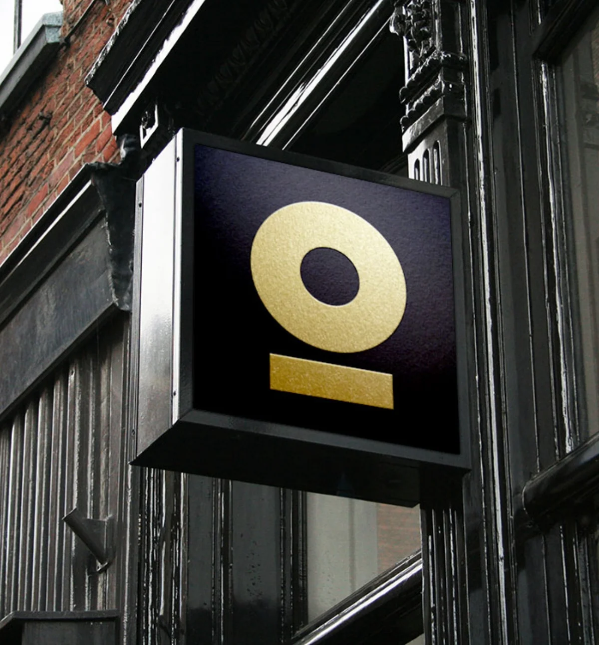
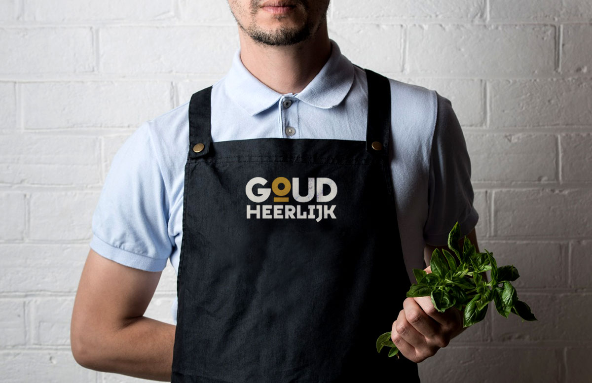
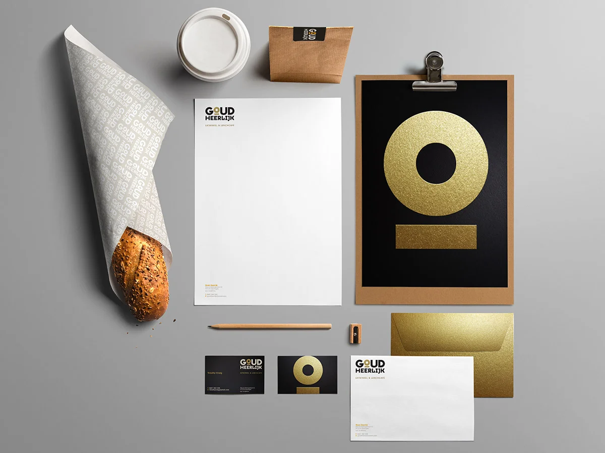
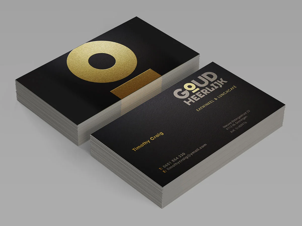
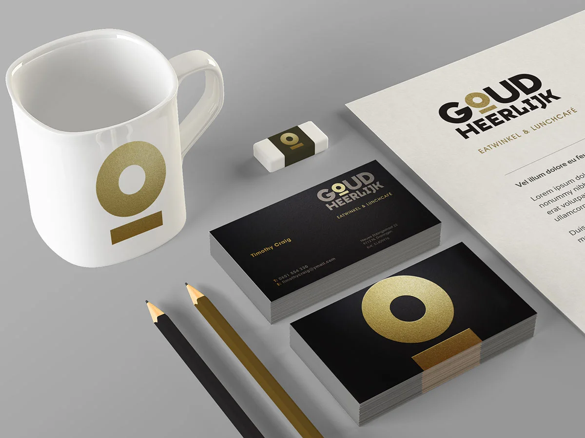
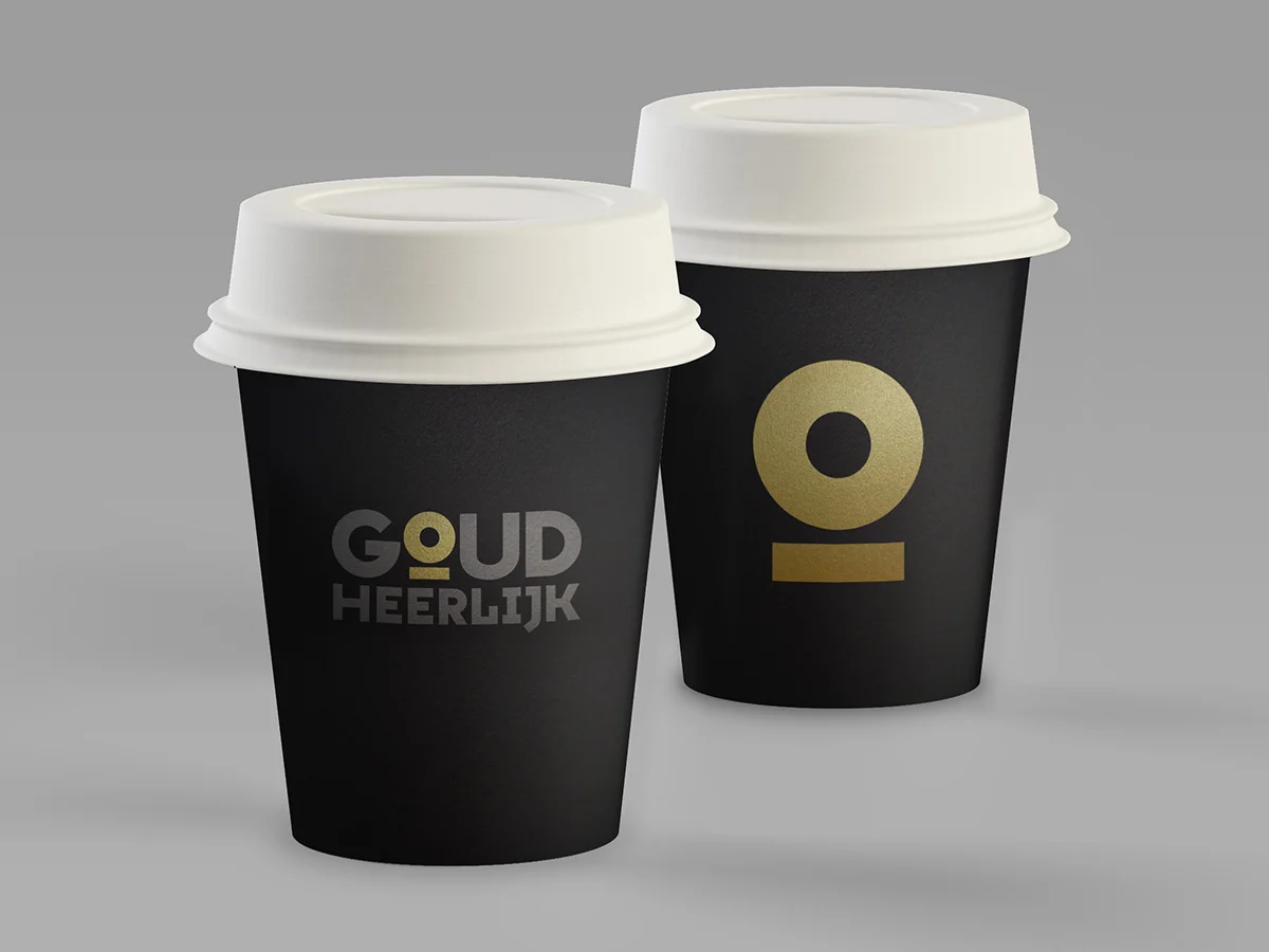
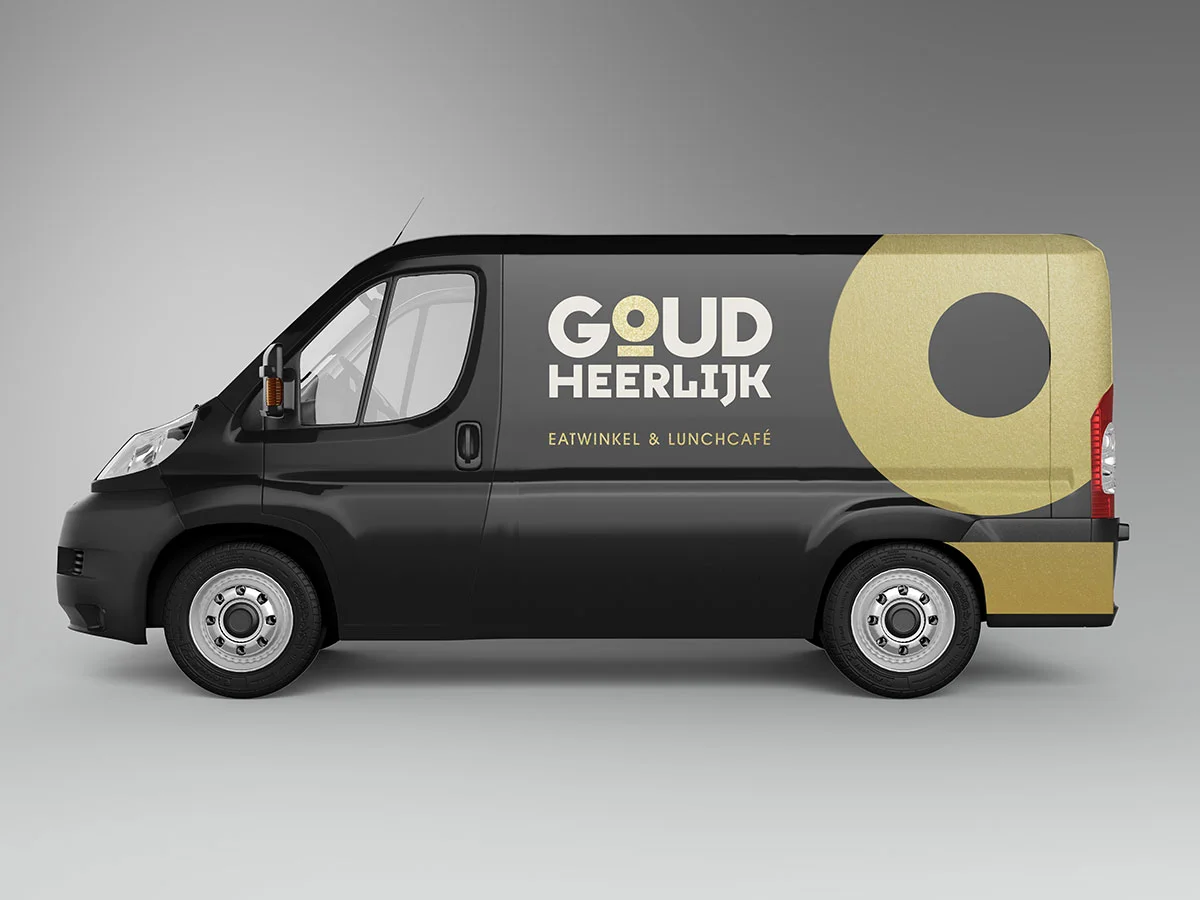
A new chain of delis were opening in Amsterdam and other Dutch cities with the name Goud Heerlijk which means golden delicious. A golden icon in the logotype was developed to give the chain strong standout in all applications. A pearlescent gold ink was specified to give the identity a deeper golden texture for the stationery and menu covers.